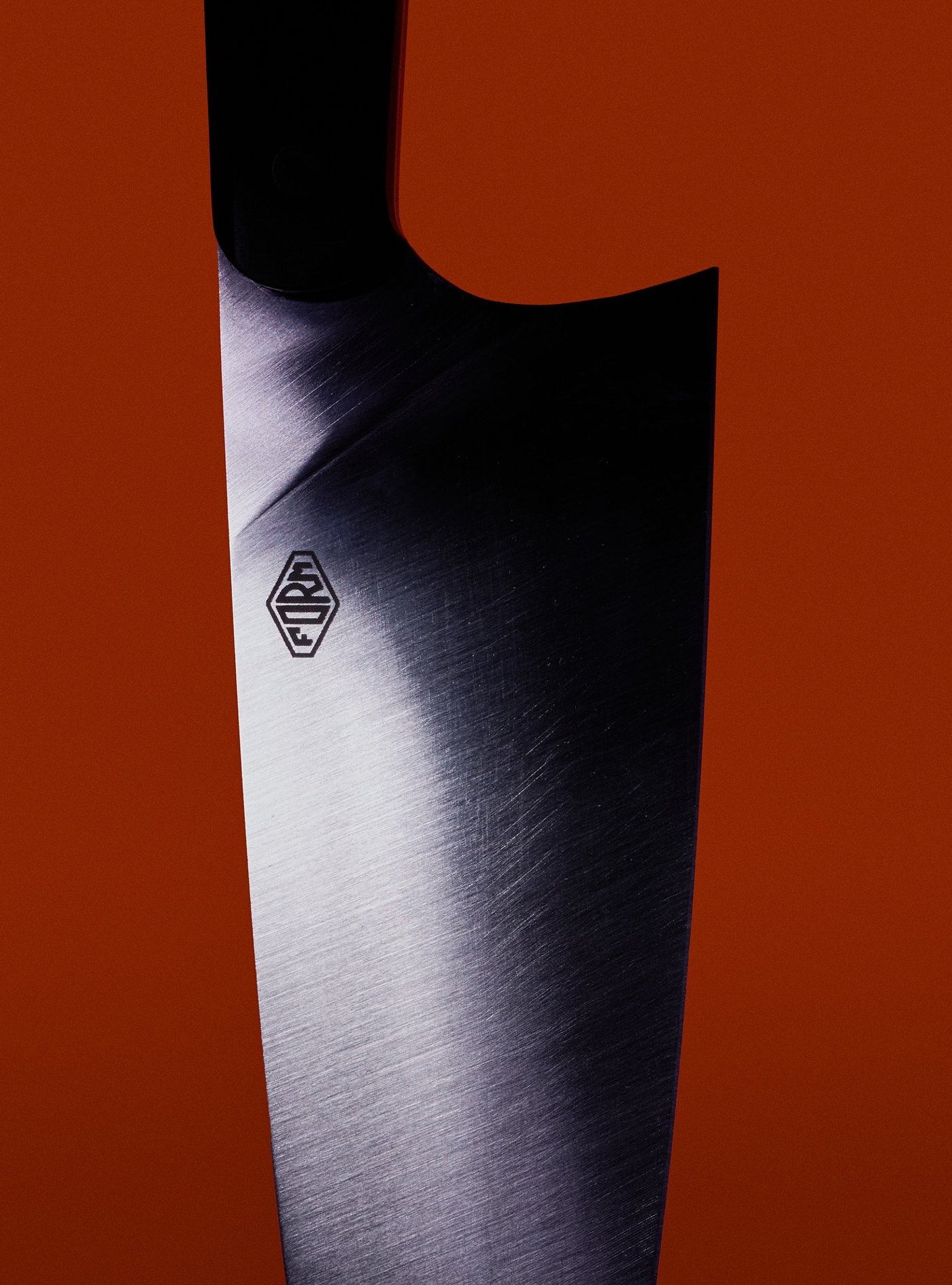
Designed in London, forged in Sheffield
Cookware bridging bladesmith heritage and professional kitchen standards.
Spacegoods
The performance wellness system for everyday life

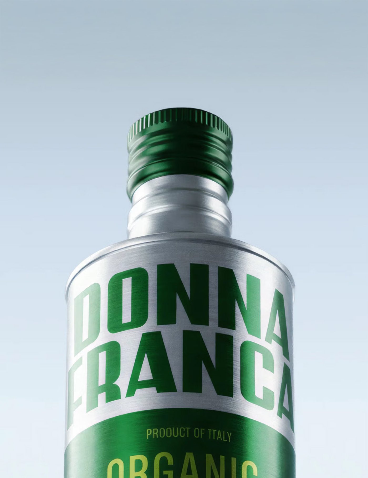
Straight from the family estate to your table
Estate olive oil from Italy's Allegretti family, brought to you by chef Thomas Straker.
Swiss precision meets luxury positioning
Swiss-engineered longevity brand balancing scientific credibility with elevated luxury. Complete identity and packaging for a 6 SKU range.

All things Dairy
A new positioning as the brand expands from butter into dairy, designing the brand world and packaging for the Cottage Cheese range.

Same pleasure. More freedom.
Re-engineered 15% ABV spirits for modern drinkers. The antidote to all-or-nothing drinking. Complete rebrand with custom typeface, bottle design, and brand mark.

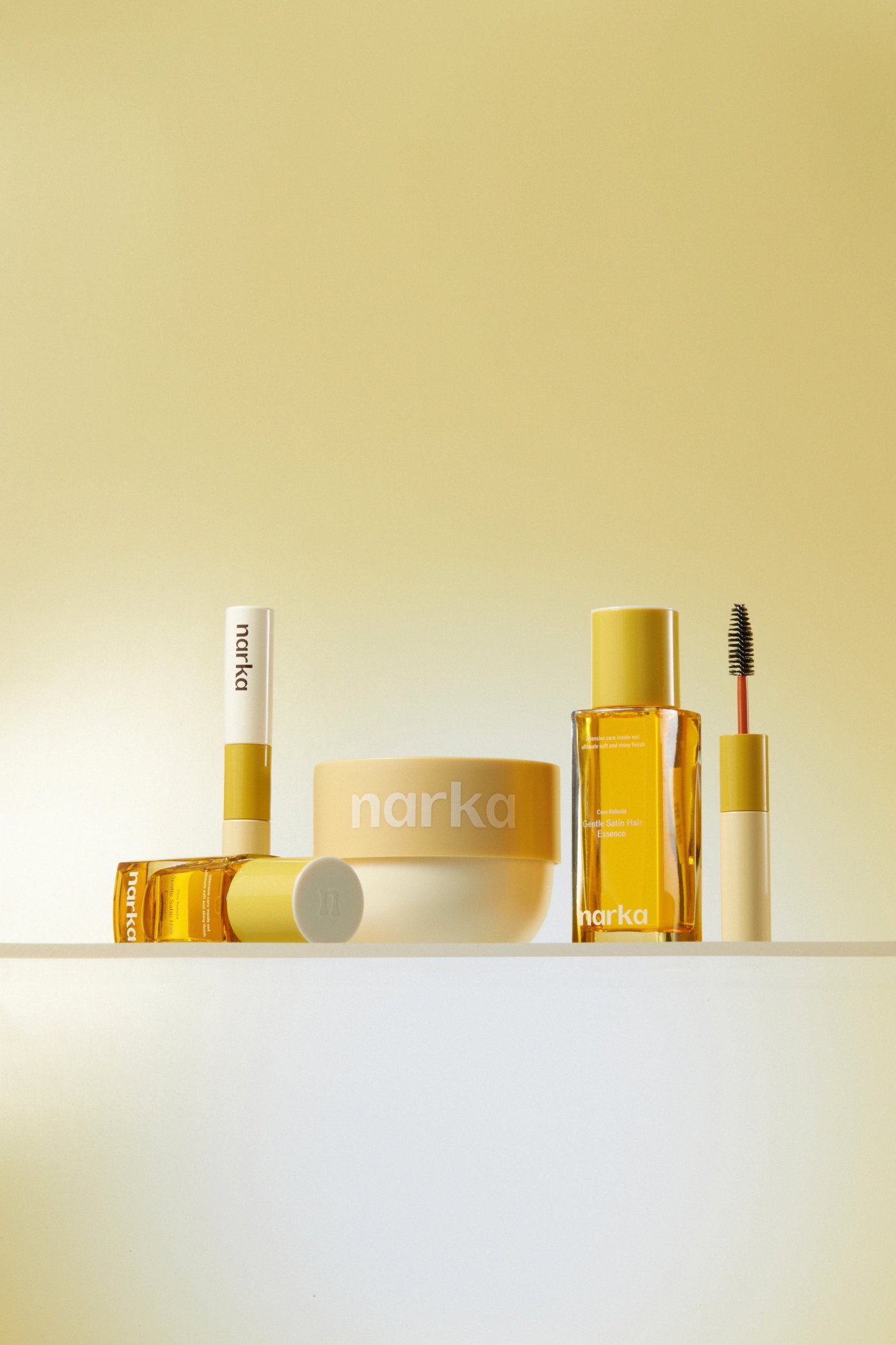
Beauty restored, layer by layer
Healthy hair and skin, enhanced from the inside out.
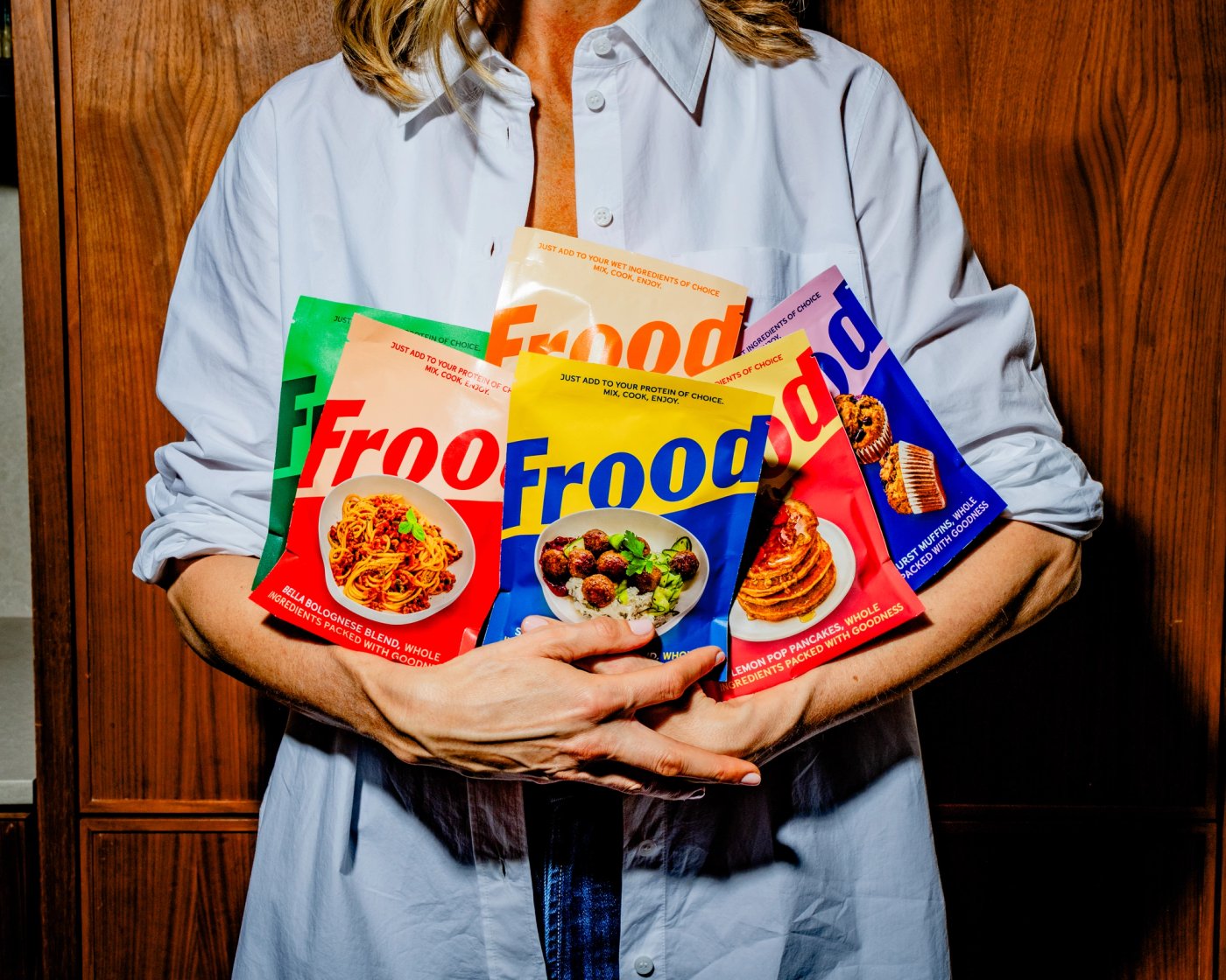
Swedish goodness, found in your local supermarket
Great convenient food for your family
The original brow experts
20 years, 16 locations. Refreshed brand elements for a new chapter.

The benchmark of English rosé
England's leading rosé ready to rival the best of Provence. Bold screenprinted bottle with folklore-inspired illustrations celebrating the joy of togetherness.

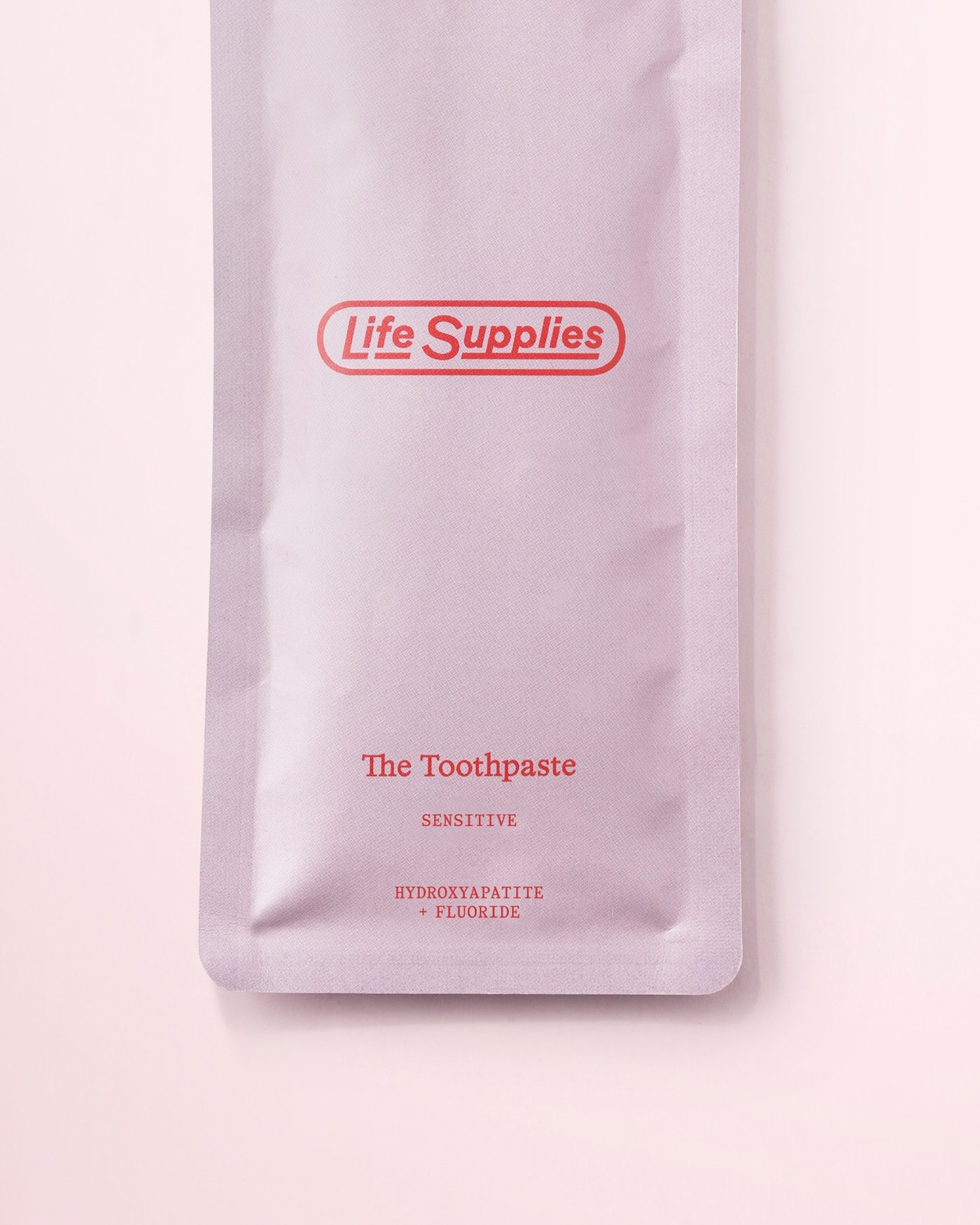
The toothpaste you actually want to use
No harsh chemicals, no nasty flavours, no plastic tubes. A new standard.
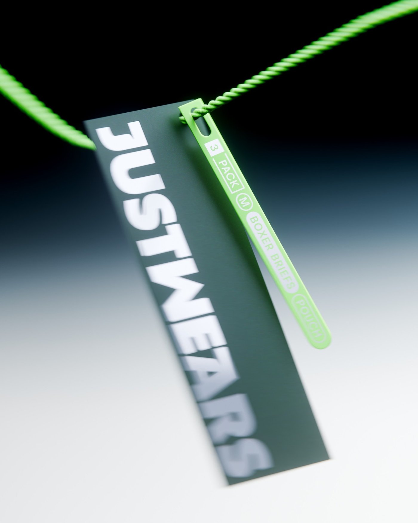
A new satisfying standard for fit and feel
Performance-led underwear solving everyday frustrations through design, ergonomics and technology. Identity balancing technical credibility with a clean, elevated aesthetic.
Your archive, always at hand
No more hunting for images across servers and drives. A device for your studio.

