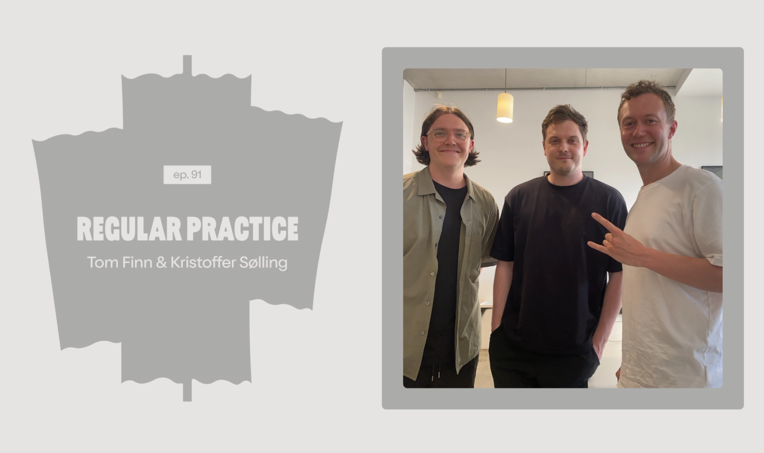
From Broadway Market to Haggerston, Regular Practice find a new home in De Beauvoir, a mile and a half north of Shoreditch.
Founders Tom Finn & Kristoffer Sølling feature on People Doing Things. A podcast designed to celebrate and inspire the entrepreneurs of tomorrow.
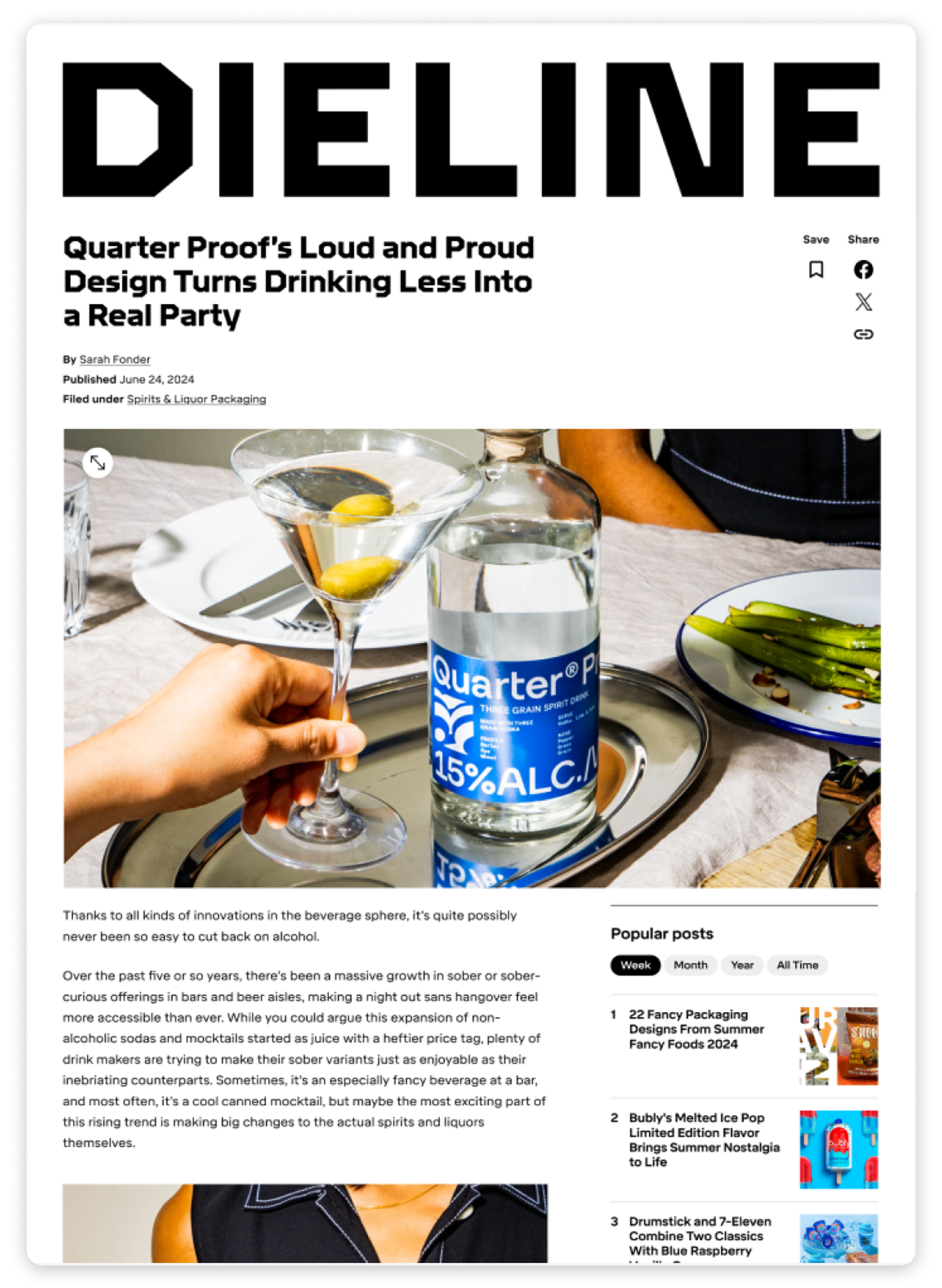
"Quarter Proof’s Loud and Proud Design Turns Drinking Less Into a Real Party"
Our rebrand for Quarter in Dieline.
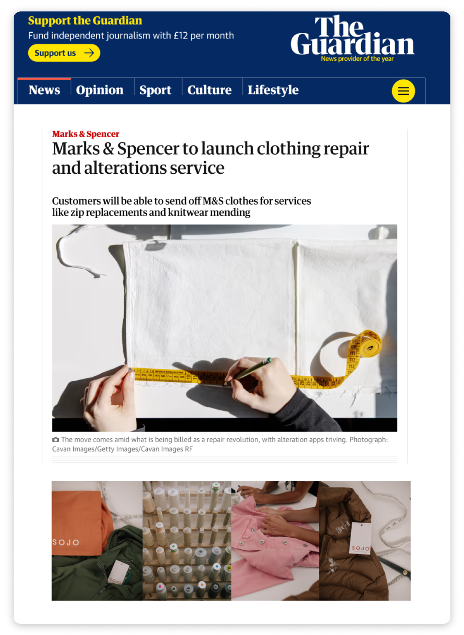
Marks & Spencer partners with SOJO to launch clothing repair and alterations service in store
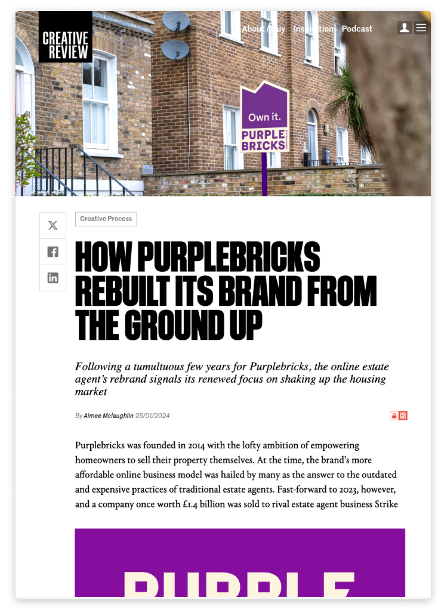
"How Purplebricks rebuilt it's brand from the ground up"
Our rebrand for Purplebricks in Creative Review.